In monitoring and observability systems, there are several types of metrics, each serving a specific purpose in data representation and analysis:
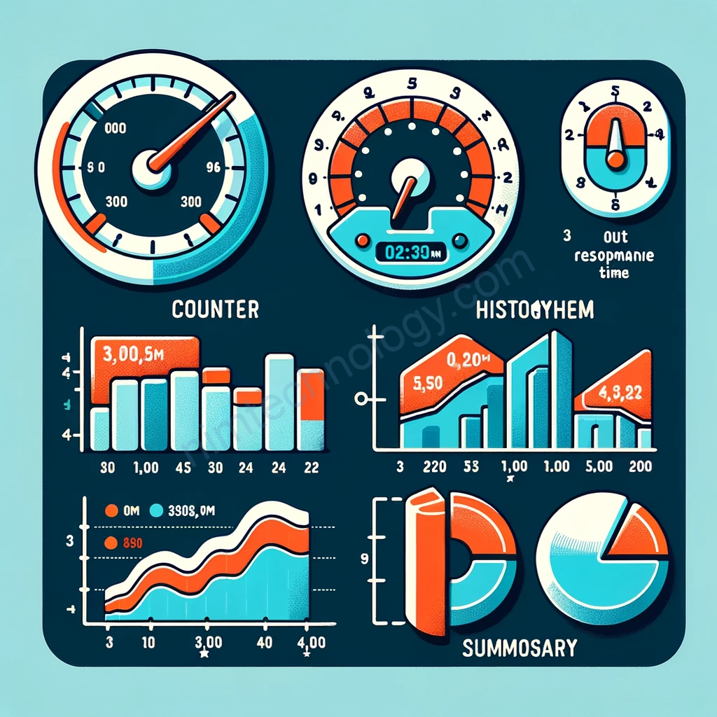
- Gauge: This metric type represents the current value of a measurement, much like a speedometer shows the current speed of a vehicle. It can increase or decrease, reflecting the current state of what’s being measured. Gauges are useful for values that change over time, like CPU usage, temperature, or current number of active sessions.
- Counter: A counter is a cumulative metric that only increases over time. It’s similar to a car’s odometer that shows the total distance traveled. Counters are used for continuously increasing values, such as the total number of requests served, errors encountered, or tasks completed.
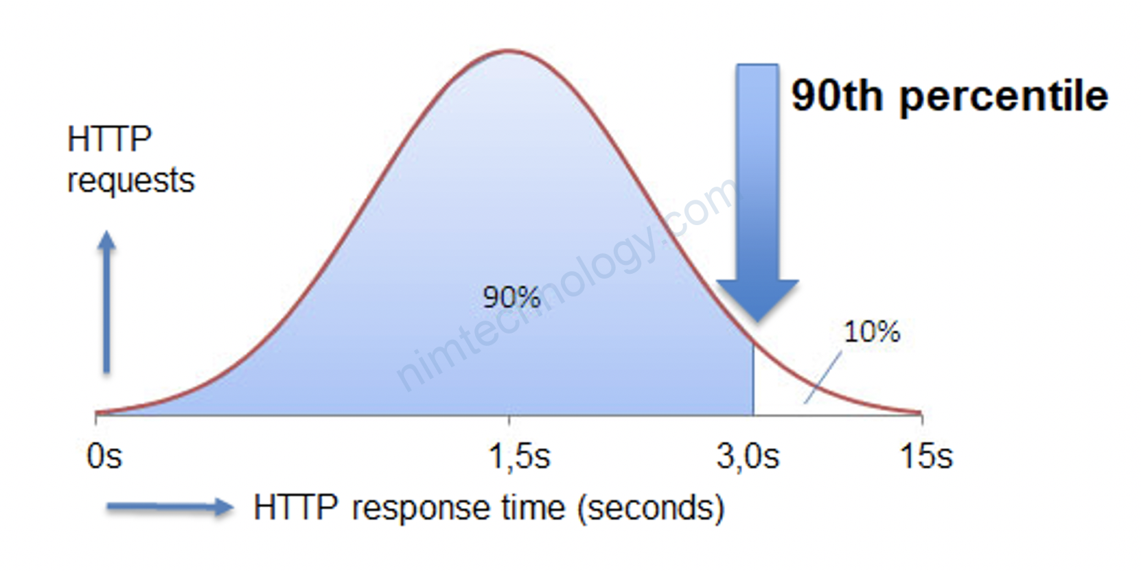
- Histogram: This metric type collects and categorizes numerical data into buckets. It’s akin to a bar chart that displays the distribution of data, such as response times. For example, a histogram can show how many requests were processed in under 100ms, 200ms, 300ms, etc. It’s useful for understanding the distribution of a data set.
- Summary: Summaries provide a statistical summary of a dataset, typically capturing the total count, sum of the observed values, and quantiles (like the 50th, 90th, 95th percentiles). It’s similar to a chart displaying the average, median, and specific percentiles of data, giving a more detailed overview compared to a histogram.
Each of these metric types offers different insights and is suitable for different monitoring scenarios. The choice of which metric type to use depends on the specific data and what you want to learn from it.
